Special Font InformationThis site uses a lot of italic "Georgia" or "Times New Roman." If you are viewing from a Mac machine, it may not look very well, as Mac's "Time" font (which may be substituted if listed fonts are not available) does not have an italic form, so Macs electronically slant the text instead. To fix the problem and see these pages as they were meant to be viewed, you can download "Georgia," "Times New Roman" and others free by following this free font link. The following information is presented in order that you might have the best possible experience at our site. We realize that the Georgia and Times New Roman fonts are not always installed on Mac machines, and that the substitute font (Times) does not have italic, as mentioned above. The following information is presented here to help you get the most from our site (and other sites you visit on the web). The typefaces (or fonts) used on a Web page, can subconsciously affect the way you feel about the page, even when you don't consciously notice them. Fonts: Do YOU see what I see?When the Web started you could only display Times. The only font constant was Times New Roman with Windows and Times on the Mac. But that wasn't absolute because anyone browsing the web is in complete control of the fonts seen. The only exception was a word that actually was being displayed as a graphic (picture), not as a typeface. The World Wide Web was the only text-based medium where designers and authors had no control over how the text looked. In fact, browsers added audio and video before anyone even thought about adding font control. Finally an HTML tag was added that let the site designer specify what font the browser should display. But there is a hitch—the font to be displayed has to be installed on the viewer's' system in order for him to see it. This means the designer can really only specify the very few fonts that he can be fairly certain will be on the viewer's computer. The designer might see lots of different fonts on his computer (and on a website he is designing), but the viewer might see something very different. The "Web-safe" font faces (which most computers support) are: Windows
|
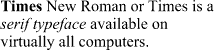 Times New Roman: a serif type that is
usually used for newspapers. It is specially constructed so that it is easier to read
on-screen, but Microsoft´s free font : a serif type that is
usually used for newspapers. It is specially constructed so that it is easier to read
on-screen, but Microsoft´s free font
Times New Roman: a serif type that is
usually used for newspapers. It is specially constructed so that it is easier to read
on-screen, but Microsoft´s free font : a serif type that is
usually used for newspapers. It is specially constructed so that it is easier to read
on-screen, but Microsoft´s free font 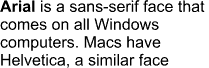 Arial: a sans-serif face (sans-serif means
without serifs—the little tags at the ends of each letter) that has a
streamlined, more modern look, but isn't necessarily easier to read on screen because of
being a bit narrow and therefore looks very light in smaller sizes. Some people think it
is also boring and looks too similar to the type used by the IRS and other tax
agencies, giving it negative subliminal connotations.
Arial: a sans-serif face (sans-serif means
without serifs—the little tags at the ends of each letter) that has a
streamlined, more modern look, but isn't necessarily easier to read on screen because of
being a bit narrow and therefore looks very light in smaller sizes. Some people think it
is also boring and looks too similar to the type used by the IRS and other tax
agencies, giving it negative subliminal connotations. 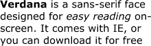 Verdana: An extremely easy-to-read
sans serif face that's included with the Internet Explorer. We have set this paragraph in
Verdana, which you will see if you have this font installed or are using the Internet
Explorer. If you do not, you should see Tahoma (a face almost identical to Verdana that
comes with Microsoft Office), Arial, or Helvetica. If you don't have this font, you can
download it for free by using the link below:
Verdana: An extremely easy-to-read
sans serif face that's included with the Internet Explorer. We have set this paragraph in
Verdana, which you will see if you have this font installed or are using the Internet
Explorer. If you do not, you should see Tahoma (a face almost identical to Verdana that
comes with Microsoft Office), Arial, or Helvetica. If you don't have this font, you can
download it for free by using the link below: | Verdana | |
|
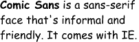 Comic Sans: An
informal, friendly font face, it is great for some sites, but not professional enough for
others. This paragraph is written in Comic Sans. If you are not using Microsoft Explorer,
you will see Times New Roman or Times. If you want this font,
download
it free.
Comic Sans: An
informal, friendly font face, it is great for some sites, but not professional enough for
others. This paragraph is written in Comic Sans. If you are not using Microsoft Explorer,
you will see Times New Roman or Times. If you want this font,
download
it free.
![]()
Other Free screen fonts:
Microsoft offers two more fonts designed for easier on-screen reading. If you do nothing else, download Georgia and you'll find documents on the Web much easier to read.
![]()
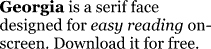 Georgia:
This serif face is much easier to read on screen than Times New Roman because it was
designed for the screen, whereas Times was designed for paper (in the 1920s!). Georgia has
excellent italics that are easy to read and attractive. This paragraph is done in Georgia.
If you do not have Georgia installed, you will see Times New Roman or Times. Download
Georgia free for Windows or Mac below:
Georgia:
This serif face is much easier to read on screen than Times New Roman because it was
designed for the screen, whereas Times was designed for paper (in the 1920s!). Georgia has
excellent italics that are easy to read and attractive. This paragraph is done in Georgia.
If you do not have Georgia installed, you will see Times New Roman or Times. Download
Georgia free for Windows or Mac below:
| Georgia for Windows 95/98/NT | |
| Georgia for Windows 3.1 | |
|
Georgia
for the Mac
|
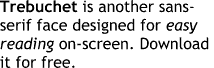 Trebuchet: Another screen-friendly
Microsoft sans-serif face. While it has more character than Verdana, isn't quite as
easy to read in smaller sizes. : Another screen-friendly
Microsoft sans-serif face. While it has more character than Verdana, isn't quite as
easy to read in smaller sizes.
Download it for free.
Trebuchet: Another screen-friendly
Microsoft sans-serif face. While it has more character than Verdana, isn't quite as
easy to read in smaller sizes. : Another screen-friendly
Microsoft sans-serif face. While it has more character than Verdana, isn't quite as
easy to read in smaller sizes.
Download it for free.
![]()
Installing and using Web fonts
First, download the fonts designed for the screen. For this site, the most important ones to download are Times New Roman and Verdana. IE users will automatically have Verdana.
Install them on your system
Windows95/98/NT: copy the fonts to the \windows\fonts folder. You may need to close your browser and restart it before the new fonts will appear.
Mac: Drag them onto the closed system folder. The system will ask if you want them installed in the fonts folder. Answer Yes.
You may want to set your browser to use one of these fonts as your default browser font.
For example, to make Georgia your default font:
Navigator4: Choose Edit/Preferences then choose Appearance/Fonts. Under Variable Width Font, choose Georgia. To make sure you see the new embedded fonts, select "Use document specified fonts", including Dynamic Fonts.
Navigator 3: Choose Options/General Preferences/Fonts. Under Variable Width Font, choose Georgia.
IE5: Choose Tools/Internet Options. From the General tab, click on the Fonts button. Under Web Page Font, choose Georgia.
IE4: Choose View/Internet Options. From the General tab, click on the Fonts button. Under Proportional Font, choose Georgia.
IE3: Choose View/Options. Click on the Font Settings button, click in the box to the right of "proportional fonts" and choose Georgia.

